Adam Spannbauer
Data Scientist/Instructor・Mostly write Python & R for pay・Mostly write p5js for fun・Check me out @thespanningset on Instagram
Proposals, diamonds, xgboost, & lime
Published Feb 09, 2018
I recently got engaged! While picking out the stone for the ring I played around with the diamonds dataset from ggplot2. The analysis was around what are the main contributors to diamond pricing. (The analysis was also an excuse to play around with the lime package for the first time.)
To start off we’ll just load the packages that will be used in the analysis.
- dataset: The dataset that will be used is
diamondsfromggplot2. To read more about the data run?ggplot2::diamondsin an R session. - data manipulation: I’m a big fan of
data.tablefor all data wrangling needs; it’s efficient & despite some arguments against it, I like its syntax & the flexibility it brings. - data viz: We’ll be doing some plotting, and it’s hard to beat
ggplot2’s output & ease of use for producing pretty static plots in R. - analysis:
- For a quick/easy way of finding the effect diamond features have on price we’ll use
xgboost - Lastly, we’ll use
lime. This package is designed to ‘explain’ classification predictions. Since it’s geared towards classification problems, we’ll bucket diamond prices into tiers; this will sacrifice some detail we could learn in feature importance, but I really wanted to play with the shiny new toy.
- For a quick/easy way of finding the effect diamond features have on price we’ll use
library(data.table)
library(ggplot2)
library(xgboost)
library(lime)
For the first steps in the actual analysis, we’re going to convert the factors (clarity, cut, & color) to numeric to turn them into ranks.
Once all our data is numeric, we’ll plot a correlation heatmap to get a feel for how the features relate to one another.
#convert ggplot2's diamond dataset to a data.table
dt = as.data.table(diamonds)

#convert all factors in dt to numeric
dt_factors = names(which(vapply(dt, is.factor, logical(1))))
dt[, (dt_factors) := lapply(.SD, as.numeric), .SDcols=dt_factors]

#plot correlations in data
ggplot(data = melt(cor(dt)), aes(x=Var1, y=Var2, fill=value)) +
  geom_tile() +
  scale_fill_gradient2(low = "firebrick",
                       high = "steelblue",
                       limit = c(-1,1),
                       name="Correlation")
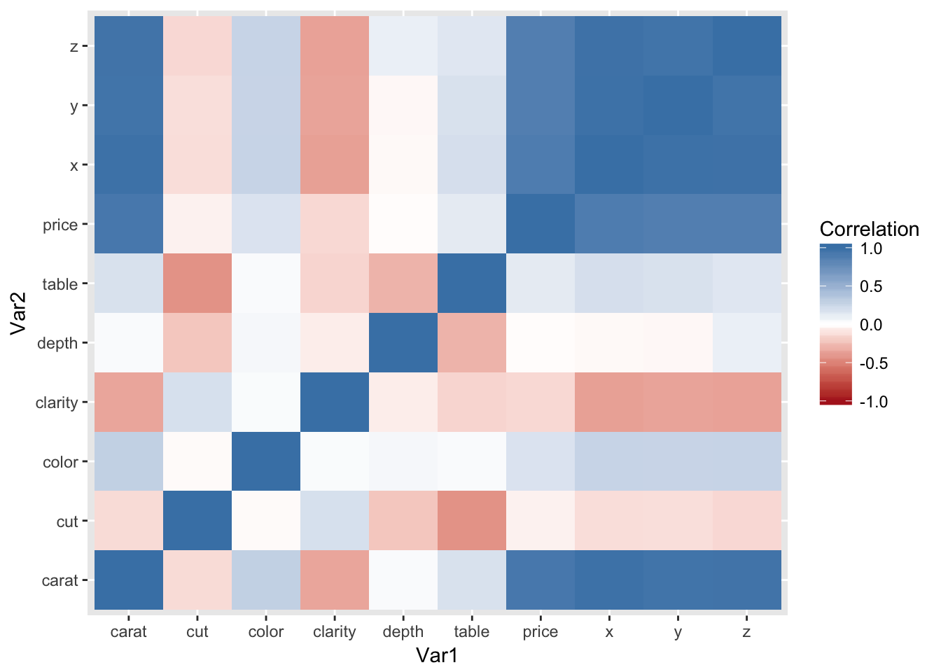
Not too big of a surprise that the physical dimensions of the diamond (x, y, & z) are highly correlated to caret. These will be dropped for the remainder of the analysis.
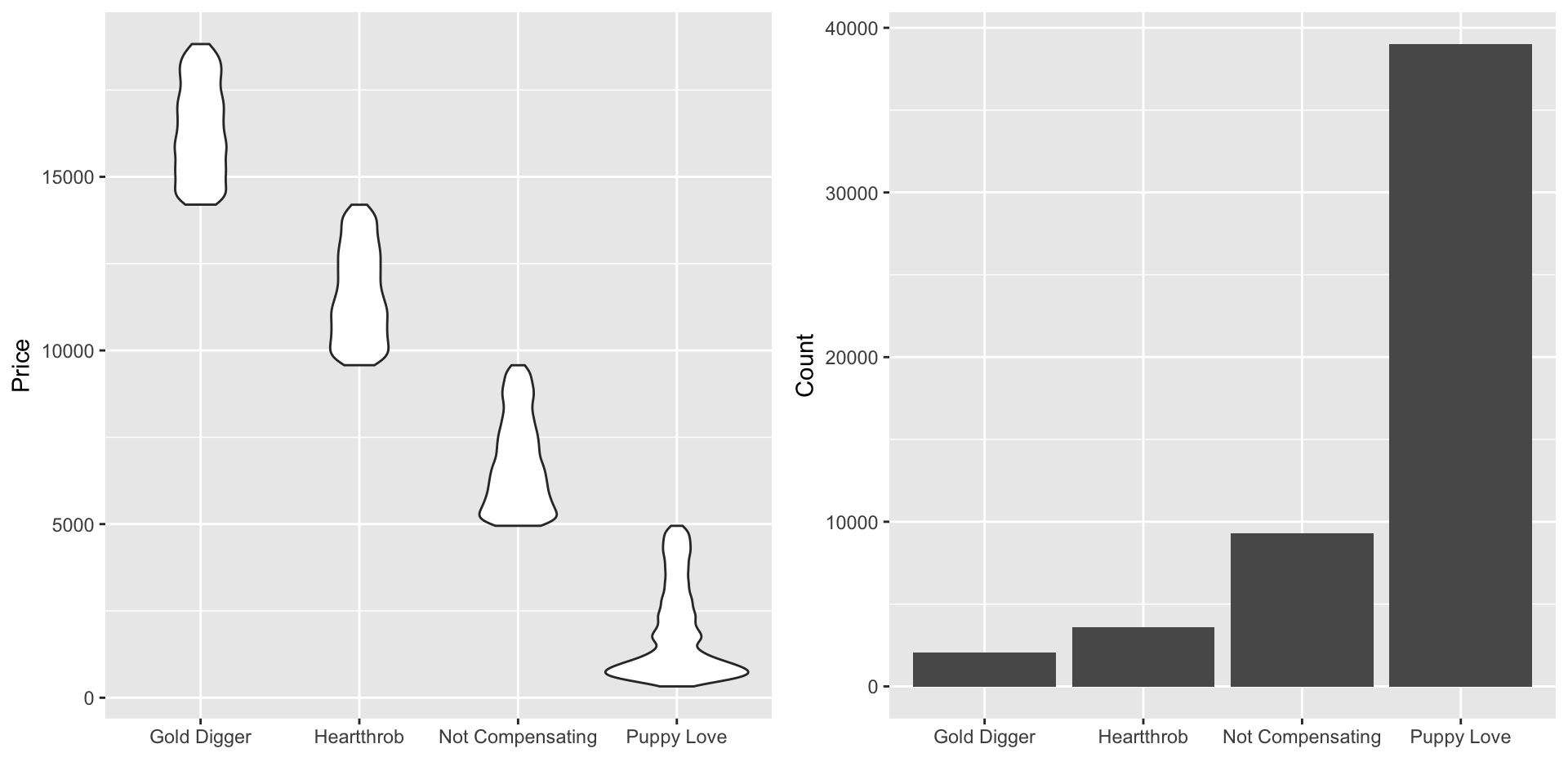
As mentioned before, one reason for this post is to have an excuse to try out the lime package. The lime package is used to explain classification models’ predictions. So to use the package, we’ll have to change this to a classification problem; the prices will be binned into 4 categories using cut.
The below chunk does the binning and produces some plots to summarize each bin.
#drop x, y, z
dt[, (c("x","y","z")) := NULL]

#bin price (zero indexed for xgboost)
dt[, y := cut(price, 4, labels = FALSE) - 1]

#dictionary of bin labels
label_dict = c("Puppy Love", "Not Compensating",
               "Heartthrob", "Gold Digger")
names(label_dict) = as.character(0:3)

#group all y info into single dt for easy plotting
y_dt = data.table(Price=dt$price,
                  num_label=dt$y,
                  #look up label in dictionary
                  label=label_dict[as.character(dt$y)])

#price distribution by bin
ggplot(y_dt, aes(label, Price)) +
  geom_violin() +
  labs(x="")

#observation count by bin
ggplot(y_dt, aes(label)) +
  geom_bar() +
  labs(x="", y="Count")
We’re now ready to get a better grasp on feature importance. An easy way to get a feel for the importance is to use an xgboost model. There are probably good arguments to use different models in this specific case, but I’ve grown to like xgboost for this kind of exploration due to its flexibility across the target data type.
#convert  x&y to type xgboost is expecting
x = as.matrix(dt[,-c("price", "y")])
y = dt$y

#won't fuss too much over the params
#since this is for exploration instead of prediction
n_rounds  = 50
xg_params = list(max_depth=5,
                 eta=.03,
                 subsample=.7,
                 colsample_bytree=.7,
                 objective = "multi:softprob",
                 eval_metric = "mlogloss",
                 num_class = 4)

#train model
set.seed(42)
xgb_mod = xgboost(x, y,
                  params = xg_params,
                  nrounds = n_rounds,
                  verbose = 0)

#extract importance in prediction
importance_dt = xgb.importance(colnames(x), xgb_mod)

#plot importance
xgb.ggplot.importance(importance_dt) +
  labs(title="Importance in Predicting Diamond Price",
       subtitle="(size matters)",
       x="")
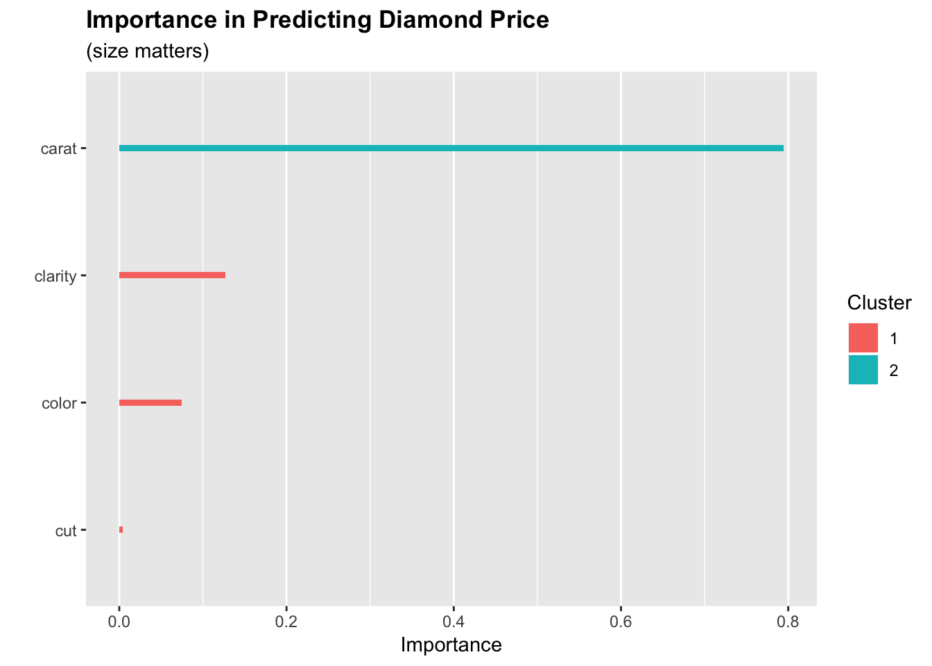
Only 4 of the diamond features were important enough to be included in the model, and we can see that carat carries most of the influence on price by itself.
The last part of the analysis will be focused on using the lime package. In the below chunk we create an explainer by providing our data and xgboost model. Then we sample 1 observation from each of our 4 classes to be explained.
#make lime diamond class explainer
explainer = lime(dt[,-c("price", "y")], xgb_mod)

#get observation from each class
set.seed(8675309)
rand_diamonds = dt[, lapply(.SD, function(i) sample(i, 1)), by=y]

#inspect
print(rand_diamonds)
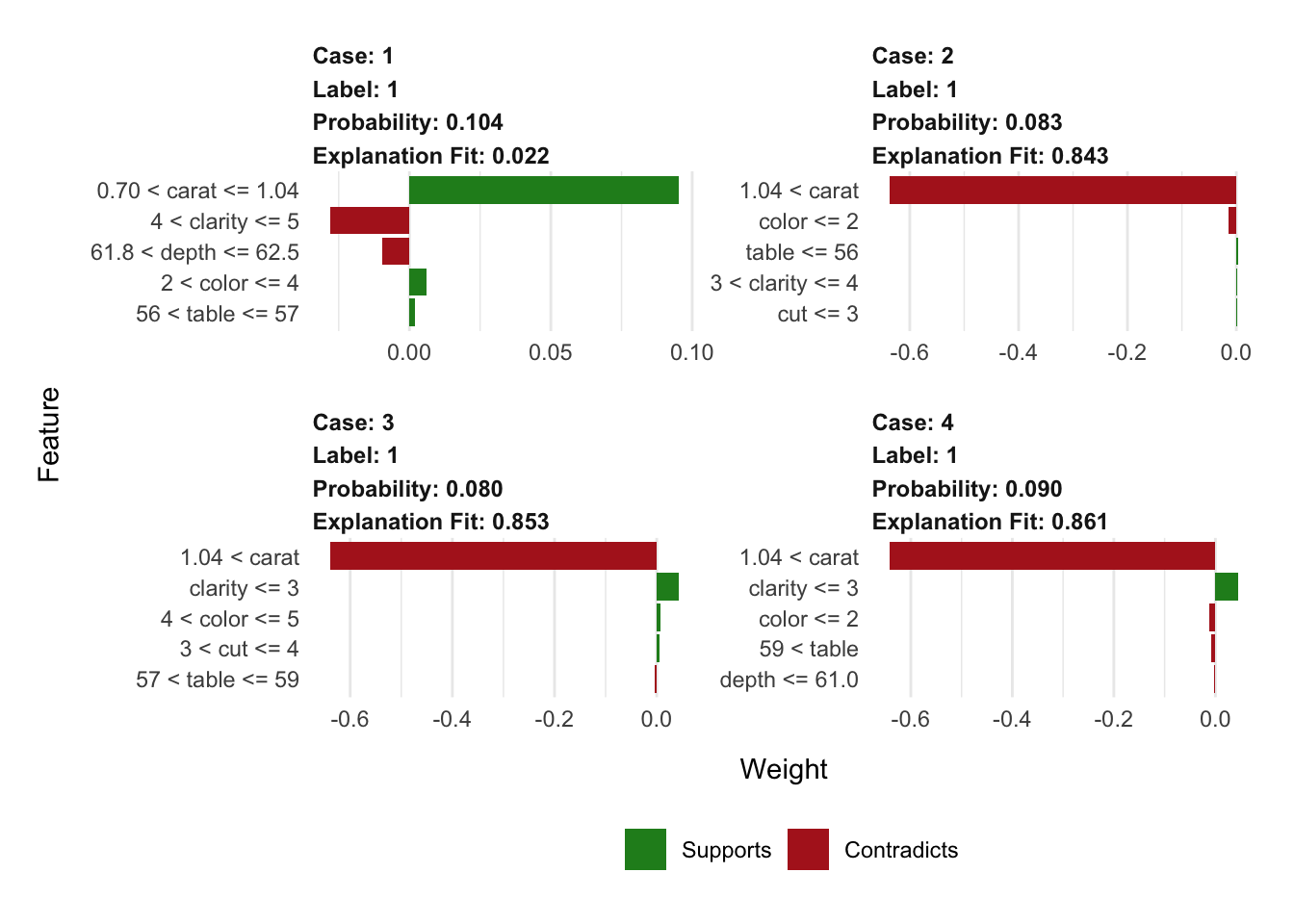
Lets tell the explainer that each of these 4 instances is in the cheapest class of diamonds. We do this by specifying 1 in the label argument (yeah, I know this conflicts with the 0 label that xgboost is actually using).
The explainer will then tell us what evidence supports and contradicts this assigned label of 1. We can see that only the diamond plotted in the top left has legimate evidence to classify it as the cheapest class; this is for good reason since it is the only observation labeled correctly here.
An interesting aspect of these plots compared to the xgboost importance output, is that they incorporate more of the features in the explanation than were actually used in the model for prediction.
#drop y vars
rand_diamonds = rand_diamonds[,-c("price", "y")]

#explain why each diamond is or isn't in the cheapest class
  #with support from 5 features
explanation = explain(rand_diamonds, explainer,
                      label = 1, n_features = 5)

#viz explanations
plot_features(explanation)
Post Analysis Cat Pic
If you’ve made it this far (or clicked the link in the intro), have a look at my kitty Jasper helping to announce the good news!