Adam Spannbauer
Data Scientist/Instructor・Mostly write Python & R for pay・Mostly write p5js for fun・Check me out @thespanningset on Instagram
rPackedBar on CRAN
Published Feb 03, 2018
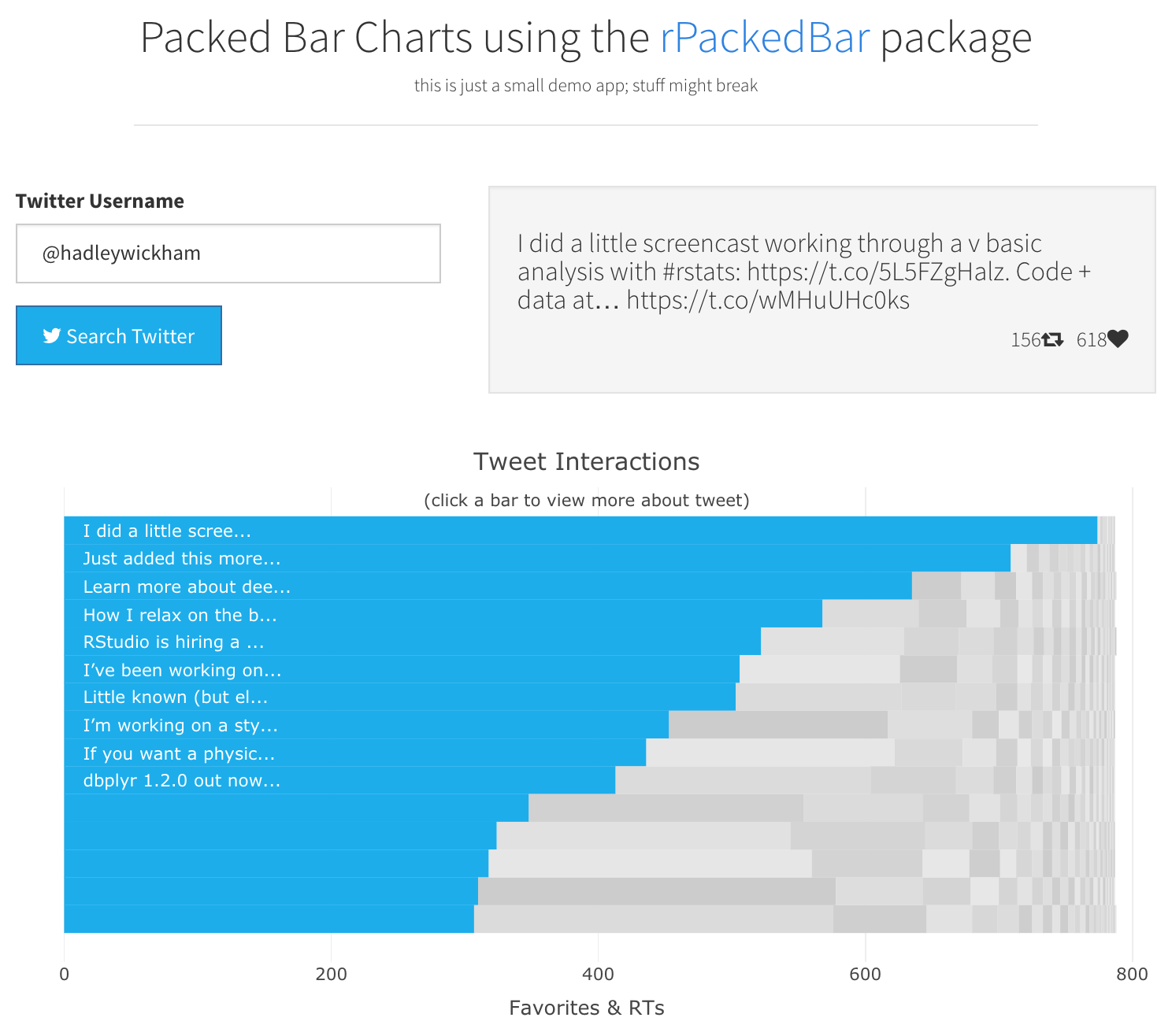
This post is to announce rPackedBar’s release to CRAN and to share a shiny app to visualize twitter interactions using a packed barchart.
This post and the package has been updated due to feedback from Xan Gregg.

About Packed Bars
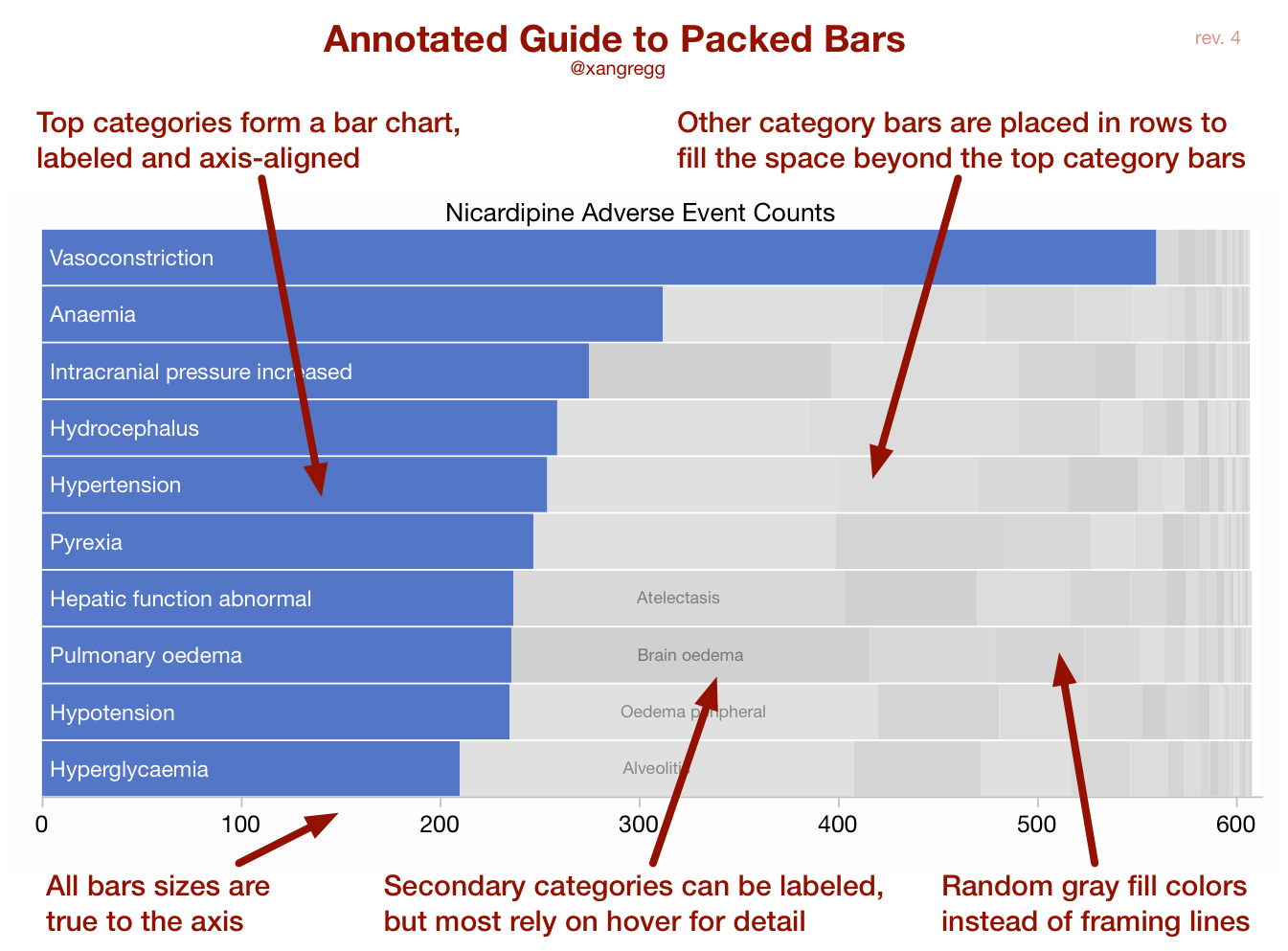
If you want to read more about the ideas behind packed bars, I’d suggest to read this introduction by the chart’s creator, Xan Gregg. Also in the linked article, he provides an annotated example that serves as a pretty good intro by itself (shown below).

Using Packed Bars in R
Installation
#install from CRAN
install.packages('rPackedBar')

#install dev version
devtools::install_github('AdamSpannbauer/rPackedBar')
Usage
library(data.table)
library(rPackedBar)

#use sample data from treemap package
data(GNI2014, package = 'treemap')
data.table::setDT(GNI2014)

#summarize data to plot
my_input_data = GNI2014[, sum(population), by=country]
#make label shorter to fit
my_input_data[country=="United States", country := "USA"]

#packed bar with default settings
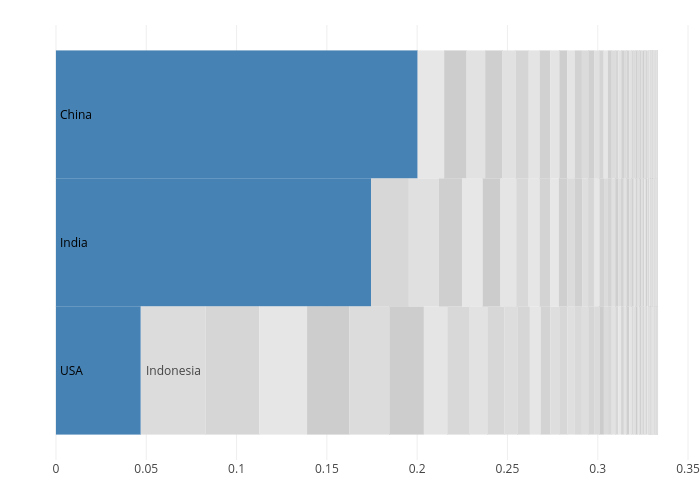
p = plotly_packed_bar(my_input_data,
                      label_column = 'country',
                      value_column = 'V1')

plotly::config(p, displayModeBar = FALSE)
rPackedBar Demo App on shinyapps.io
If you want to see some more example usage of the rPackedBar package without having to write any code you can check out a toy app I published on shinyapps.io. The app grabs some tweets for a given user and uses packed bars to plot tweet interactions (as measured by retweets and favorites). You can see example output in the screen shot at the top of this post.
Note: The app uses the functions packedBarOutput & renderPackedBar. At the time of writing this post, these functions are not included in the version of the package on CRAN. They are included in the dev version that can be installed using: devtools::install_github('AdamSpannbauer/rPackedBar')
Update to Post & Package
The updates to the package are only available in the dev version at the time of writing this.
Thanks again for the constructive feedback.
— Adam Spannbauer (@ASpannbauer) February 5, 2018
☑ Left align primary bar labels
☑ Lighter grays in secondary bars
☐ Auto-determine label width to avoid unlabeled primary bars while avoiding labels spilling over bar (non issue in interactive use though) pic.twitter.com/eroaqnCo6a
