
Adam Spannbauer
Data Scientist/Instructor・Mostly write Python & R for pay・Mostly write p5js for fun・Check me out @thespanningset on Instagram
Visualizing Emotes in Twitch Chat with a Packed Barchart
Published Jan 12, 2018
In this post I’ll be an showing an example of using a packed barchart to visualize emote usage in a twitch.tv chat.
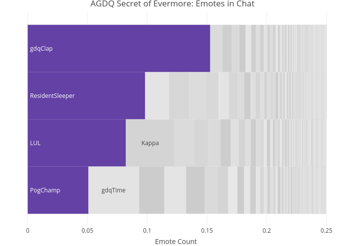
In case you’re not interested in any commentary or code snippets, here’s the resulting packed barchart from the analysis.
Every January there’s an awesome charity event on twitch.tv called Awesome Games Done Quick (AGDQ). The charity has raised millions and millions of dollars for the Prevent Cancer Foundation.
![]()
![]()
While watching the event, I decided to record some of the GamesDoneQuick twitch channel’s chat (this was done using irssi). With this data, I went on to visualize the chat’s emote usage. The emote usage should roughly follow an exponential distribution, so the packed barchart lends itself well to visualize the data. Below is the resulting viz of emotes during the Secret of Evermore speedrun by MetaSigma.
All of the code & data used to get to this part in the analysis is in this github repo. The below code chunk shows the final steps in creating the viz.
#download dev version of packed bar plotting library
devtools::install_github("AdamSpannbauer/rPackedBar")

#url to read data from sister git repo
sister_repo_url = "https://raw.githubusercontent.com/AdamSpannbauer/twitch_packed_bar/master"

#read function to clean twitch chat log
source(paste0(sister_repo_url, "/helper_scripts/clean_log_func.R"))

#read and clean twitch chat file
agdq_log = irssi_to_df(log_file_in = paste0(sister_repo_url, "/data/%23gamesdonequick.log"),
                       date = "2018-01-11",
                       verbose = FALSE)
#tokenize chat messages
tokens = tidytext::unnest_tokens(tbl = agdq_log,
                                 output = token,
                                 input = msg,
                                 to_lower = FALSE)
#count words
token_counts = tokens[, .N, by=token][order(-N)]

#read in all emotes to join with chat tokens
sub_emotes = readLines(paste0(sister_repo_url, "/data/emote_list.txt"))
glb_emotes = readLines(paste0(sister_repo_url, "/data/global_emote_list.txt"))

#convert emotes to dt for join
sub_emote_dt = data.table::data.table(type="sub",
                                      emote_name=sub_emotes)
glb_emote_dt = data.table::data.table(type="global",
                                      emote_name=glb_emotes)
emote_dt = rbind(sub_emote_dt, glb_emote_dt)

#join emotes to chat tokens
emote_counts = merge(token_counts, emote_dt,
                     by.x='token', by.y='emote_name')
emote_counts = emote_counts[, .(N = sum(N)), by=token]

#plot emotes as packed barchart
set.seed(1337)
p = rPackedBar::plotly_packed_bar(input_data = emote_counts,
                                  label_column = 'token',
                                  value_column = 'N',
                                  number_rows = 4,
                                  plot_title = "AGDQ Secret of Evermore: Emotes in Chat",
                                  xaxis_label = "Emote Count",
                                  hover_label = "N",
                                  min_label_width = .03,
                                  color_bar_color = "#6441A4",
                                  label_color = 'white')
plotly::config(p, displayModeBar = FALSE)
Unsurpsing to anyone who’s participated in a Games Done Quick chat, the number one used emote was gdqClap emote which viewers use to applaud runners for completing technical tricks.

For a little extra content let’s compare another possible way to visualize the data that doesn’t use the packed barchart.
#encode tokens as factor to sort correctly in barchart
emote_counts = emote_counts[order(-N), ]
emote_counts[,token := factor(token, token)]

#plot top 15 as horizontal bars
p = plotly::plot_ly(emote_counts[1:15],
                    x=~N, y=~token,
                    hoverinfo="x",
                    color=I("#6441A4"))
#fix axes labels and margins
plotly::layout(p,
               xaxis=list(title="Emote Count"),
               yaxis=list(title=""),
               margin=list(l = 150))
In my opinion, there’s no clear winner. As with most things, the answer is “it depends”. If you’re really focused on comparing the top 15 then the simple barchart might be a better choice. If you want to show more information on how the top N relate to each other and the whole, then I think the packed barchart can show this information well (without having to to use a piechart or treemap that sacrifice the comparitive power of the bars). If you have any strong opinions on how best to viz the data please leave a comment below.
I am working on getting the rPackedBar package to a point where it can be pushed to CRAN. If you are interested in using the package while it’s being developed you can install it from github using devtools::install_github("AdamSpannbauer/rPackedBar")
. If you do end up using I’d be very excited to hear any feedback and suggestions for improvement.